Junto
Providing a more engaging and safe environment for users to engage in deep, meaningful conversations.
ROLE
UI/UX Designer
DURATION
3 weeks
TOOLS
Figma
Miro
TEAM
Jameka Josephs
Zenia Kim
Tomomi Tsukioka
OVERVIEW
Junto is a digital platform that allows users to engage in structured, small group conversations around specific topics such as current events or social issues. Junto believes that meaningful connections are created when discussions are organized and held in smaller, more intimate live groups. Junto is centered around the abilities to engage, empower and incentivize with others.
Users can sign up to create or join small virtual conversations without any scheduling or facilitation like a fully-automated book club. Organizations can curate conversation guides and invite their audience to participate and interact with others on the platform.
It is also about building communities. A safe space where each user can be themselves while having open and honest dialogues with fellow users.
TYPES OF EVENTS
There are three types of events the users can experience: hosted, hostless, and livestream.
In a hosted event, rooms are guided by a host and there is a limit to the amount of participants.
In a hostless event, an unlimited number of participants are led into smaller breakout rooms for a conversational experience. The group votes together on how to move on from one section to the next.
In a livestream event, an unlimited amount of participants watch a livestream then are taken into smaller breakout rooms. The phase of watching a livestream to a breakout room may loop a few times.
DISCOVER
STAKEHOLDER INTERVIEW
Before conducting any research, we interviewed our stakeholder, the founder of Junto, to gain a better understanding of objectives for his platform. After talking with him, we were able to establish these goals and visions for our project.
For our goals, we were determined to design a way to increase user engagement while further valuing and understanding the users’ feedback.
As our vision, we strived to keep true to Junto’s brand while promoting an inclusive, positive sense of community and environment for the users.
GOALS
Incorporate waiting room
Add post-conversation CTA
Engage users
Gain user feedback
Measure success
VISION
Demonstrate seamless flow
Maintain Junto’s brand
Establish sense of community
Promote inclusivity
Encourage positive reinforcement
With our stakeholder interview, we agreed on three aspects to improve:
Incorporating a waiting room before users are placed into conversation rooms
Adding some shape of post-conversation call-to-action to encourage users to continue the dialogue
Possible color scheme change
TASK ANALYSIS
We next conducted a competitive analysis in order to understand competitive applications that offer similar discussion spaces like Junto.
Task: Create Account
Discord
Click on “Register”
Enter phone or email
Enter email
Register by username and password
Enter date of birth
Create account
Facebook Groups
Click on “Create New Group”
Name group
Choose type of privacy
If private, choose type of visibility
Invite friends by typing name or selecting from suggestions
View desktop preview
View mobile preview
Press “Create”
Geneva
Click on “+” button on side navigation
Select “Create Your Own Home”
Customize rooms in your home
Name home
Add a home description
Choose a home color
Choose a home privacy setting
Done
Task: Join/Create
Discord
Create your own server or start from template
Choose “For My Friends” or “For Community”
Discover “Featured Communities”
Facebook Groups
Select “Join Group”
Answer questions
Submit answers
Cancel request if wanted or await approval
Geneva
Click on “+” button on side navigation
Select “Create Your Own Home”
Tap on “Already Have An Invite?”
Invite link from clipboard will be automatically copied to join
ELEMENT ANALYSIS
We conducted an element analysis to compare applications to look at waiting room and reviews system ideas.
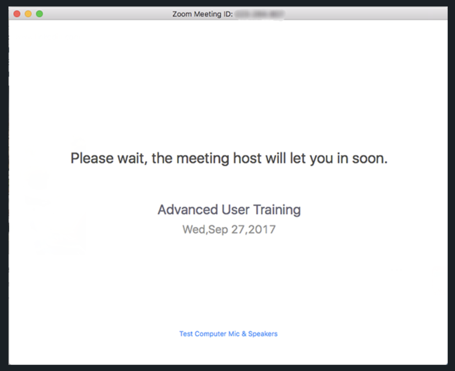
Zoom has an initial room for the user to wait in before entering the conversation.
This provides a way for the user to utilize the waiting time by getting ready before joining the room.
The host would also have the opportunity to prepare before the participant joins while providing a smooth and seamless transition.
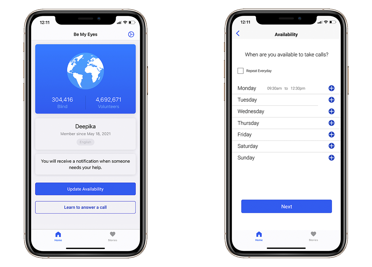
With Uber, we noticed that the user is presented with the option of rating their driver with a star ranking or giving a compliment with an icon of choice.
They may also leave a personalized thank you note or give feedback on how their experience could be improved. These options allow the users to feel heard and give input on future improvements to be made.
By providing the compliments feature, the app promotes positive reinforcement by motivating the drivers to maintain or improve their work performance.
CONTENT AUDIT
Before moving onto the define phase, we decided to thoroughly navigate and experience the current existing state of Junto. We were able to better understand and relate to the users as a result.
In the waiting room, we learned that there were no activities the user can interact with while waiting. We felt that there was a lack of providing an engaging and entertaining way to excite the user before joining the conversation.
After the conversation has ended, we were met with optional post-convo screens.
When providing feedback, we felt that only providing a star rating system would inhibit Junto from further understanding the users’ thoughts and feelings in depth.
It would be difficult to gain detailed feedback regarding issues or potential ways to enhance their experience.
We now understood the basic user flow that was needed in order to better the experience of the Junto users. In green, we see the existing flow of Junto users and in grey, we see the tasks that need to be added.
DEFINE
USER INTERVIEW
We conducted user interviews with 9 participants. From these interviews, we wanted to understand on how users:
stay informed on current events/news
talk and share opinions on online platforms
decide which platform to use to share their thoughts and opinions
learn more about the causes they care about
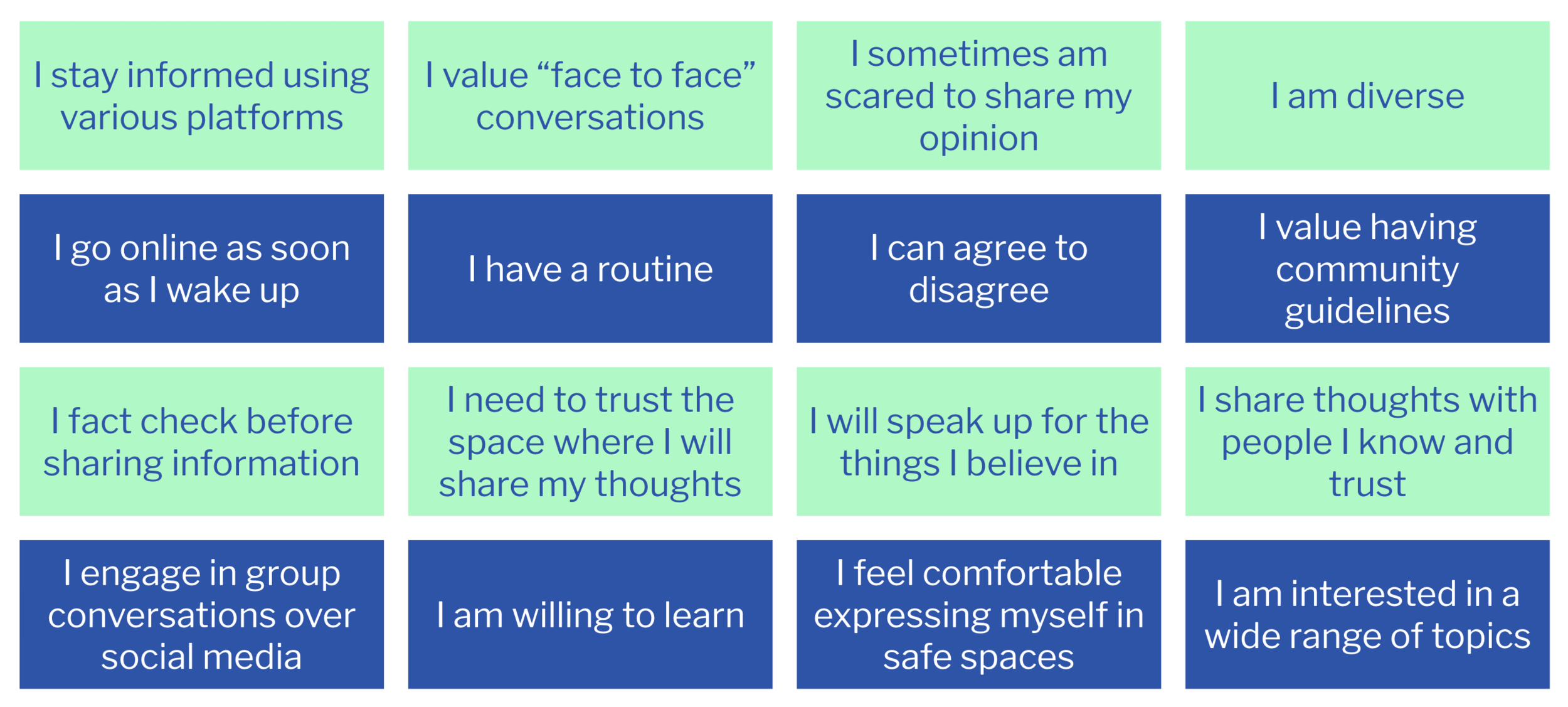
We created “I” statements from questions including the above.
JUNTO USER INTERVIEWS
We also conducted user interviews with actual Junto users. We needed to understand pain points and likes. We also created “I” statements from these interviews.
PRIMARY PERSONA: RIVER
As a result of our research, we created our primary persona. River is someone who already enjoys and actively participates in open discussions. He loves connecting with new people and is currently looking for a platform where he can have close peer interactions. He appreciates being able to learn from and connect with new people and seeks to find a platform that provides intimate peer interactions.
Wants
A space to share their thoughts and opinions
A place to meet like-minded users
Needs
A space to safely share their opinions
A place to talk about several different topics
Pain Points
Haven’t found a space to have small, intimate conversations
Unable to find a way to have discussions about one specific topic of interest with others
SECONDARY PERSONA: JAISHA
Jaisha has been an active user of Junto who joins conversations at least once a week. She enjoys having discussions about topics she’s interested in and stays updated on current events/news.
Wants
Participate in an inclusive environment
Develop personal relationships with users
Needs
Provide feedback on conversation
Leave feedback on other participants
Offer improvements to be made
Pain Points
Has trouble feeling included in conversations
Feels like some conversations become too subjective
PROBLEM STATEMENT
User needs an intimate digital space to have meaningful discussions so that they can freely share their thoughts and opinions while developing close interpersonal relationships with others.
JOURNEY MAPPING
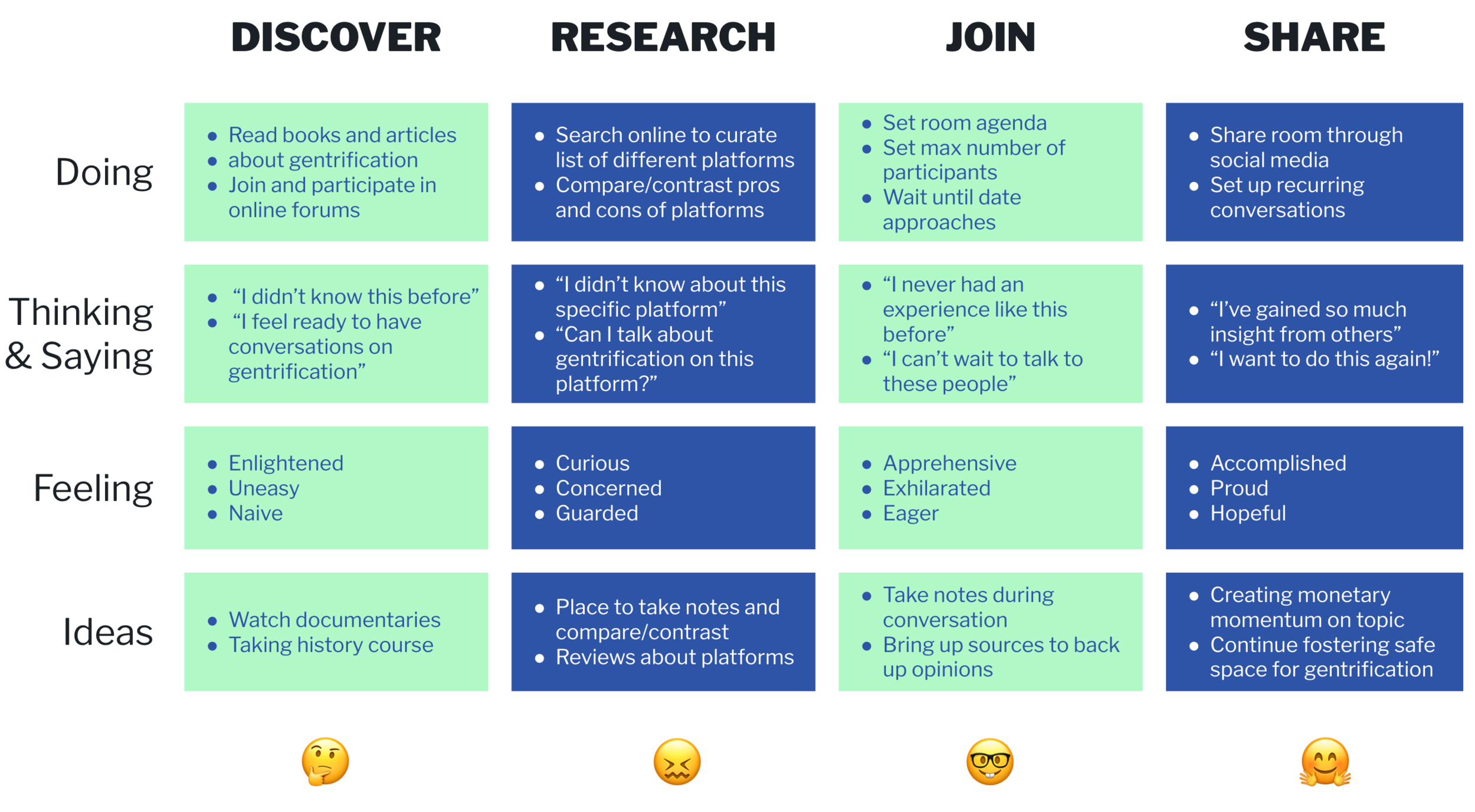
We also created a journey mapping for River to visualize the process that he would go through when it comes to group conversations.
USER FLOW
We then created a user flow that will illustrate the basic of flow of one user.
DESIGN
SKETCHES
Design studio and final sketches created as a team.
COLOR REVISION
We also discovered through research that users thought Junto's existing color palette could be more colorful, so we changed it to make the platform feel more dynamic and pleasant.
We kept blue to evoke feelings of trust, self expression and wisdom in our user. We decided to add orange into the color palette because it represents feelings of sociability, friendliness and confidence.
DELIVER
USABILITY TESTING
We conducted usability testing on 6 participants with 4 goals and 14 tasks. We noted the time it took each participant to finish and how many errors, if applicable, they faced.
96% of the users successfully navigated through the prototype.
Goals:
User can successfully navigate through the entire process under 7 minutes
User can identify the purpose of the waiting room with no more than 1 error
User can provide feedback on conversations and participants under 3 minutes
And lastly, User can complete the donation process with no more than 2 errors
Tasks:
Understand the purpose of waiting room
Understand the content or function of each activity in waiting room
Understand the function of countdown timer
Navigate through ‘Did you know?’ activity successfully
Read and digest ‘Did you know?’ content
Did not find the amount of text overwhelming
Rate the conversation
Gave feedback on potential improvements
Rated a partipant
Understood purpose of Donation modal
Understood the purpose of icons on Donation modal
Successfully completed donation payment
Exited the conversation room
Did not skip any information throughout whole experience
ITERATIONS
From our usability testing, we were able to make iterations for our final prototype. On the left is our initial prototype and the right is our iterations.
With our prototype we tested, and we did not have the timer visible in each activity room during the waiting room. In our iteration on the right, we added the timer so users know the remaining time before the conversation starts.
For the participant feedback slide, we gathered insight from users that they felt like the star rating was not contributing to the positive environment Junto promotes. We removed the star rating and kept the participant feedback to positive badges user can assign.
We also added a “submit” button in order to successfully show the user that they have saved their feedback submission.
On our donation details slide, some users felt unsafe and unsure if they would want to donate to an organization without knowing more about them. In our iteration process, we added the organization logo and a short description of the organization.
Lastly, we had comments that the lack of knowing how many more screens users have to go through to finish the end-of-conversation process was troublesome.
We added a progress tracker to let users know where they are in the process.
PROTOTYPE
Our prototype created in Figma.
Interact with prototype →
TAKEAWAYS
I enjoyed working with my teammates with a real world client. I have learned how to work with key stakeholders and to understand the business needs while keeping the users in mind.
Moving forward, I would want to do another round of user interviews to gain insight on what really motivates users to continueI dialogues after conversations.
I would also want to do a deeper usability testing on the user interface.


